Lessons from SlideShare 1: Images and Design
by Steven S. Vrooman
I have been critiquing visual aids on Instagram for quite a while now. I do find things I like:

But most often I find things that annoy me.
I don't have any set method to this madness. I just scroll around sometimes. And when I find something that I love or hate, I throw some green analysis text on it and go.
I was taking my Rhetoric class through the process of inductive reasoning to develop a thesis from a diverse set of coded texts and I wondered if I could do the same with my own stuff.
It turns out I can. This is likely just evidence of things that annoy me, not necessarily the key things to avoid when crafting visual aids, but it was surprising to me, as if you read my book, I have quite a few things ab out visual aids that annoy me, and this is not the total list of them. So perhaps we can call these...
There. Totes viral, that title, yes?
I should note, in response to something you might be thinking, that I KNOW that much of SlideShare these days are simply booklet-type things that are not actual slidedecks that people would use in a presentation. They are designed like comic books of children's picture books to advertise for the company that produces them. Fair enough. And that means they will all have more text than I'd like, because one of the cardinal rules of presenation visual aids that SlideShare breaks is that...
Still not viral, I know.
This means that you should not need to look at your visual aids to see where you are, like this:
But you should also not make something that is a book-in-disguise. If the audience can tune you out and read the slides (or sleep) they will. Then why are you speaking? You've sacrificed all imapct you could make.
Okay.
Even given that SlideShare changes this equation sometimes (there are folks who still load used slidedecks up there), there are still errors that matter.
So here are the EGREGIOUS ERRORS. I have broken this up into an ongoing series of posts, since there are quite a lots of errors that pop up. These are errors of images and design and the way they interact. Thing with text and graphs/charts will be next in line. So tay tuned.
Some examples:


Images without a clear point are Distraction DEFCON 2. But images which actively cause the audience to try to figure out what's going on and inevitably find an answer which distracts from the point raises that to DEFCON 3 or 4.
Of course, images which cause the audience to think about the connection and then the result of that thinking adds to the presentation experience are great. But that kind of thing is super-rare on SlideShare. Here's one of the few:

This "additive relationship" is, for Scott McCloud, one of the things that makes comic books special. It's not just pictures. It's not just text. They can synergize:
The hardcore and irony-strewn version is:
I know, everything doesn't have to look like the icon of simplicity, Steve Jobs:
And there is a time and a place for complex, provocative design, like the work of David Carson:
But people are not trying to find the sweet spot. They are trying to use the sad cookie-cutter of the Kawasaki Rule to reduce their number of slides arbitrarily, and they end up with messes like these:


This is the one I was not expecting as a category. It simply surprised me that designers would be so horrifyingly careless. As an audience member, how could you not simply reject this presenter entirely given their disregard for your situation in the audience? The slides are painfully bad, with bleedingly obvious problems that hurt the eyes.
For me, every example in this post so far would make me react with horror. But I'm talking about normal people here. Normal people who might consider the Lazy Dog typewriter slide above to be "kinda okay." Maybe that's you? But for even you "normals" out there, these have to be bothersome:


There were lots less of these, but still, wow. If I was TRYING to hurt your soul with a slide, I might design something similar. The only thing worse might be the Gettysburg Address PowerPoint made as a joke:
I have been critiquing visual aids on Instagram for quite a while now. I do find things I like:
But most often I find things that annoy me.
I don't have any set method to this madness. I just scroll around sometimes. And when I find something that I love or hate, I throw some green analysis text on it and go.
I was taking my Rhetoric class through the process of inductive reasoning to develop a thesis from a diverse set of coded texts and I wondered if I could do the same with my own stuff.
It turns out I can. This is likely just evidence of things that annoy me, not necessarily the key things to avoid when crafting visual aids, but it was surprising to me, as if you read my book, I have quite a few things ab out visual aids that annoy me, and this is not the total list of them. So perhaps we can call these...
THE MOST EGREGIOUS ERRORS YOU CAN MAKE WHEN YOU HAVE AN AUDIENCE WHO CARES ABOUT VISUAL AIDS!
There. Totes viral, that title, yes?
I should note, in response to something you might be thinking, that I KNOW that much of SlideShare these days are simply booklet-type things that are not actual slidedecks that people would use in a presentation. They are designed like comic books of children's picture books to advertise for the company that produces them. Fair enough. And that means they will all have more text than I'd like, because one of the cardinal rules of presenation visual aids that SlideShare breaks is that...
YOUR VISUAL AIDS SHOULD REQUIRE YOU, NOT BE REQUIRED BY YOU
This means that you should not need to look at your visual aids to see where you are, like this:
 |
| https://rmsbunkerblog.files.wordpress.com/2015/01/hqdefault.jpg |
Okay.
Even given that SlideShare changes this equation sometimes (there are folks who still load used slidedecks up there), there are still errors that matter.
So here are the EGREGIOUS ERRORS. I have broken this up into an ongoing series of posts, since there are quite a lots of errors that pop up. These are errors of images and design and the way they interact. Thing with text and graphs/charts will be next in line. So tay tuned.
1. Distracting, Pointless Images
Images without a clear point are Distraction DEFCON 2. But images which actively cause the audience to try to figure out what's going on and inevitably find an answer which distracts from the point raises that to DEFCON 3 or 4.
Of course, images which cause the audience to think about the connection and then the result of that thinking adds to the presentation experience are great. But that kind of thing is super-rare on SlideShare. Here's one of the few:
This "additive relationship" is, for Scott McCloud, one of the things that makes comic books special. It's not just pictures. It's not just text. They can synergize:
 |
| http://www.fourcolorcriticism.com/wp-content/uploads/2010/12/Additive-Relationships.jpg |
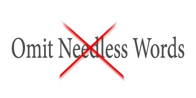
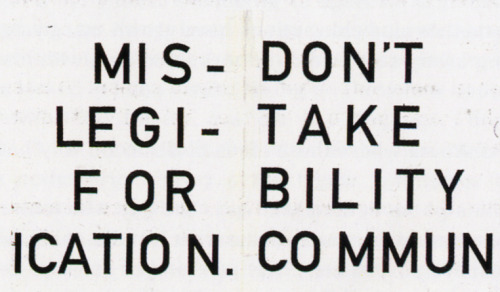
2. Clutter
Your default should be the simple. This is true visually, but also textually. You may have heard the famous advice from Strunk and White:
 |
| https://s-media-cache-ak0.pinimg.com/736x/33/0d/84/ 330d84312b73f68076a451195c5f04f2.jpg |
 |
| http://infosnacks.com/img/2012/omit-needless-words.jpg |
 |
| http://2.bp.blogspot.com/-d1mEYd_QmgE/UUcgYdKZJwI/ AAAAAAAABao/e3YE0WpeqHE/s320/Capture+d%E2%80%99e%CC %81cran+2013-03-18+a%CC%80+15.10.03.png |
 |
| http://41.media.tumblr.com/2f138a04510ebb1912f69461828a688c/ tumblr_mgvxsjOW6A1s33yrwo1_500.jpg |
3. Catastrophic Lack of Care for the Audience
For me, every example in this post so far would make me react with horror. But I'm talking about normal people here. Normal people who might consider the Lazy Dog typewriter slide above to be "kinda okay." Maybe that's you? But for even you "normals" out there, these have to be bothersome:
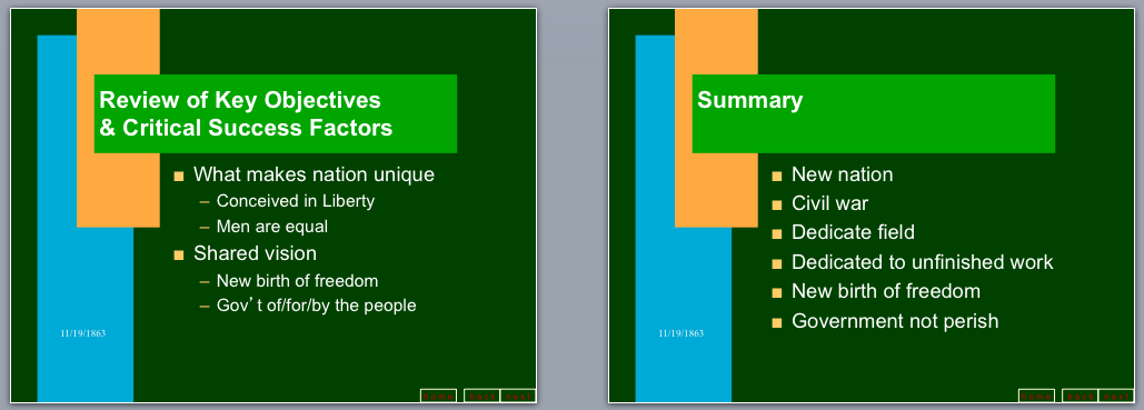
There were lots less of these, but still, wow. If I was TRYING to hurt your soul with a slide, I might design something similar. The only thing worse might be the Gettysburg Address PowerPoint made as a joke:
 |
| http://www.idea.org/blog/wp-content/uploads/2013/08/Screen-Shot-2013-08-29-at-2.42.07-PM.png |
Conclusion
What can we conclude from this, if we were in Rhetoric class? I'm not entirely sure we have enough data yet. But perhaps it would be this: "Vrooman thinks most slide designers are either lazy or hostile." I'm not sure that is fair to designers or to Vrooman, so perhaps we will wait until the next "Lessons from SlideShare" blog post to find out.

