Memorability Is Not the Same As Engagement: The Problems with the Borkin Study on "Visual Recognition and Recall"
Borkin and Associates' (2016) article, "Beyond Memorability: Visualization Recognition and Recall," which has yet to even see print, is making waves in the blogosphere and on reddit and twitter.
Sigh.
Look, the work is fine, but everyone is using is for the wrong reasons.
Here's a good example. Khokar's conclusion is "I often help out colleagues with making charts, graphics and data visualizations for the web and my first piece of advice is always to start with a great title or headline. There’s a lot to take away from Michelle’s work but if you take just one thing, take this."
John Wihbey inteviews first author Michelle Borkin and tries to suggest her work invalidates Edward Tufte's ideas on simplicity in graph design. Borkin, to her credit, kind of dodges that: "What’s interesting is that in Tufte’s first book, The Visual Display of Quantitative Information, he does promote simplicity and cleanliness and a high “data-ink ratio” – he says you want as much of the graphic as possible to relate to the data – but he also does talk about how text annotation can help encode data and get the message across."
Why are people using it for the wrong reasons? There are at least two:
1) Vrooman Hates This!: Use This Strange Headline Fetish to Pretend You Know How Succeed in Social Media!
The title fetish. You've seen it:
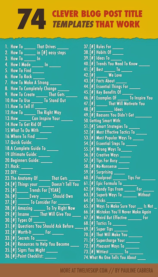 |
| http://blog.hubspot.com/marketing/blog-post-title-templates-infographic |
Doesn't this look like your Twitter feed if you follow enough SEO "gurus"?
I think the Borkin study is getting play because it intuitively validates the use of manipulative and repetitive titling of blog posts and the mushroom forest of programmed tweets to follow.
In terms of Power Point, would you title a graph if the software didn't drive you to it? If you had to drop a text box down and actually DECIDE to title a slide, would you? It's hard to imagine a world where you haven't been overtrained to do it that way, but can you try for a second?
Is it not cooler to do it like McCandless?
 |
| http://infobeautiful4.s3.amazonaws.com/2010/11/main_peak_breakups.png |
Watch his TED Talk to see how he presents this line and then asks his audience to engage. Only later does he tell them what is represents. It is magic. No one who has seen it ever forgets it. No blog post EVER that used the title suggestion 60 on the infographic ever achieved such impact.
2. It Confuses Memory with Impact
Just because I remember doesn't mean I am moved or persuaded or taught. I remember Donald Trump's talking points this year. Not convinced. If I can sing every McDonald's theme song for the last 30 years, does that mean I'm a customer? Not me. Maybe you. Memory is a start, but it is never enough.
The Borkin study assumes that what audiences find memorable is what you should try to perfect in order to be more memorable. Borkin, in that interview, says "we empirically prove these conventional design guidelines." Um. Excuse me? Really?
Tufte analyzes how data visualization affect people's DECISIONS, not RECALL. In Visual Explanations, he spends a great deal of time on how John Snow used a map to understand how cholera worked and how bad analysis of data doomed The Challenger. The Borkin study has nothing to contribute here.
Their study is a bandwagon fallacy on stilts. Just because people believe a thing doesn't make it true or important. If I remember your title, perhaps it is because your graph stinks and I can't understand it. Does it follow that I should focus on making a cool title THE MOST IMPORTANT THING the way the Borkin study conclusion and blog posts like Kohkar's suggest?
Nope.
Think of all the work that goes into a data visualization. All the decisions. All the research. All the design problems. And you'd rather they pay attention to the title, legends/labels and the PARAGRAPH YOU PUT UNDER THE GRAPH TO EXPLAIN IT?
Those are the things the Borkin study concludes are the most memorable. That doesn't mean they matter.
What if you had none of them?
Even the best audiences are cognitive misers.They are, at least a little bit, avoiding thinking or engagement. They are processing the text you give them as an escape from depth of thought. The text is easier, so they focus there.
A great study by Pylar and associates (2007) shows that for people who self-reported as LIKING graphs, who had as much time as they liked with them and who saw them both in video and on paper, less than half interpreted them accurately. In other words, in close to ideal conditions for graph understanding, mostly we fail.
Graphs are hard. They convert numbers into shapes. They increase cognitive load in order to facilitate larger-scale thinking about numerical comparisons. In the end, they make it easier, but we often don't follow to the end.
You have a purpose for your data and your visualization. Don't make it easier for the audience to avoid.
 |
| https://i.ytimg.com/vi/4F4qzPbcFiA/maxresdefault.jpg |

