Zombie Statistics, Part 1
By Steven S. Vrooman
In the new edition of The Zombie Guide to Public Speaking, I added a chapter on the ways we fail to do our research. I decided to share a part of that chapter, from a section I call "Zombie Statistics," because the world needs to know the problematic history of this Curve of Attention. It is the prime example of something fake we believe because it is in graphical form. Public speaking textbooks, slideshares, blog posts, tweets . . . it is EVERYWHERE! It took me a few months of interlibrary loaning to gather enough resources to debunk it, but here it is:
In the new edition of The Zombie Guide to Public Speaking, I added a chapter on the ways we fail to do our research. I decided to share a part of that chapter, from a section I call "Zombie Statistics," because the world needs to know the problematic history of this Curve of Attention. It is the prime example of something fake we believe because it is in graphical form. Public speaking textbooks, slideshares, blog posts, tweets . . . it is EVERYWHERE! It took me a few months of interlibrary loaning to gather enough resources to debunk it, but here it is:
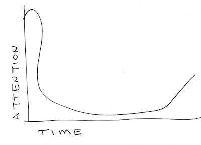
The Curve of Attention
This
thing has been trotted out for years. We believe it because it makes sense. I
even suggested it might have some merit in Chapter 6. The audience pays the
most attention to us at the beginning, gets sleepy and then wakes up at the
end. Here’s Sam’s version of it:

Each
version has a slightly different shape to The Curve. The reason is that there
is no actual data to back this up.
I first saw this while writing the teacher’s
manual (Vrooman & Egan, 2009) for Fraleigh & Tuman (2009), where the authors
suggest that it is based on a “Study by TCC Consulting (San Francisco, Calif.),
undertaken between 1987 and 1997” (p. N-4). Emails to the authors about this
data never got a response. I found The Curve again in Kenny (1982), who
suggests it is a result of studies conducted on students. The y axis of his
graph is labelled as “Percentage of class paying attention” (p. 13), but he
then describes some uncited experiments about how much students can recall after lectures of different
lengths, which is a different sort of y axis entirely.[1]
He cites Mills (1977) as the source of The Curve and the research behind it,
but when I finally tracked down a copy of Mills’ book, his Curve, exactly the
same as Kenny’s, is based not on data, but on “an analogy between the learning
process and the process of digestion” (p. 18).
A
digestion analogy. Really?
What
he suggests about this analogy makes intuitive sense, which is why people keep
reproducing it, but what we have is something that has become “fact” for us
only because it got turned into a graph. And Mills is reasonably clear that
this is just a thought-experiment and analogy: “the shape of the curve in the
hands of a good instructor can be modified almost at will” (p. 19).
I
later found McGrath’s (2015) citation that The Curve is based on Bligh’s (2000)
book, first published in 1971. Bligh bases almost all this on Lloyd’s (1968)
work, creating a series of diagrams based on what Lloyd “hypothesizes” and
“confirms” (Bligh, 2000, p. 49). The trouble is that Lloyd’s two-page article
is based on his own observations of student restlessness in his classes, hardly
sufficient rigor to “confirm” a hypothesis and graph the data.[2]
Yet,
by now The Curve is used as if it were a classic
study, you know, with data behind
it. Red Magma (2009) tosses their version into a Slideshare which sells their
elearning consulting. They use it as the central
data point for why lectures are an inefficient method of learning. Sharpe
(2012) suggests The Curve is an “amalgam of all sorts of things from
physiological responses to recall about part of the session.” She cites
additional “numerous studies” on our 10-15 minute attention spans in “passive
tasks” like lecture. This is a commonly reported statistic that, according to
Wilson and Korn (2007) has no real supporting evidence besides personal
experience and anecdotes.
The
fun of all of this is that writers keep changing the shape of The Curve for
their own purposes while still asserting that it is based on data. Fraleigh and
Tuman’s (2009) Curve jumps up a bit
higher at the conclusion than the 50%-ish in Mills’ (1977). Niemantsverdreit
(n.d.) has a curve that goes to 100% attention really quickly at the
introduction and then never seems to get up to 50% again.[3]
McGrath (2015) has another like it. Sharpe’s remains really flat at the end,
popping up to what we might imagine is about 20% at best. In contrast to these
attention skeptics, MichCommunication (2012) gives us a graph that looks like a
bowl, with the conclusion optimistically popping up to what looks like is even
over 100%! Reimold and Reimold (2003) have a graph that pops up to the 100% at
the end, but really sharply. Like the one I commissioned for this chapter, it
looks to be drawn by hand.[4]
If
I see you presenting this Curve of Attention as a fact you will lose just about
all of your credibility with me. This graph is reproduced because visual aids
seem “truthy.” It is what happens when people do simple searches to find
something they want to say and need simple support. Everyone just needs to do
better research, especially in professional contexts. The Internet makes it
easier to find zombie statistics, but it makes it easier to debunk them, as
well.
[1] I was going to reprint the graph for you, but it turns out that
reprinting one graph from a book 30 years out of print would cost me more than
$150. Since I’m trying to keep this book as inexpensive as possible, that
wasn’t going to happen. Welcome to the ins and outs of self-publishing! You
can, if you’d like, go to Google Books and search “Peter Kenny attention curve”
and see the famous graph for yourself, though.
[4] If you Google “Attention Curve” you will see these versions and many
others. You will also see some distressing examples of The Curve being adapted
to other contexts, especially for Internet content audiences. The virus
spreads…

